
Starter Activity
|
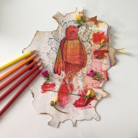
Another piece I did in a week and a half. We were instructed to create a piece on a abnormal and random surface and we had to draw a bird of a crab and use different type of art materials.
The bird in my picture was supposed to look dead and decaying but I guess I wanted to make it look “prettier” by using lively colours (even though its dead). It fits with the current theme : Beauty and Decay, and I really wanted to emphasize on my “We find Beauty in Decay, and Decay in Beauty” statement. Also, the bird is surrounded by dead leaves but also lively flowers (Beauty and Decay converging into one). I burnt the surface to show that the paper was close to “being dead” but it’s still alive and we see lively colours on the surface. The dead leaves were painted using bleach and ink which was a new experience to me, and honestly my surface still kinda smells like bleach. I used watercolour to paint the bird, however I layered it with colour pencil to give it some kind of texture so that it would seem more feather-y looking (?). That tissue was actually pretty helpful as it became the tail of my bird which was kind of unique in a sense. |
Stage One - Mind Mapping
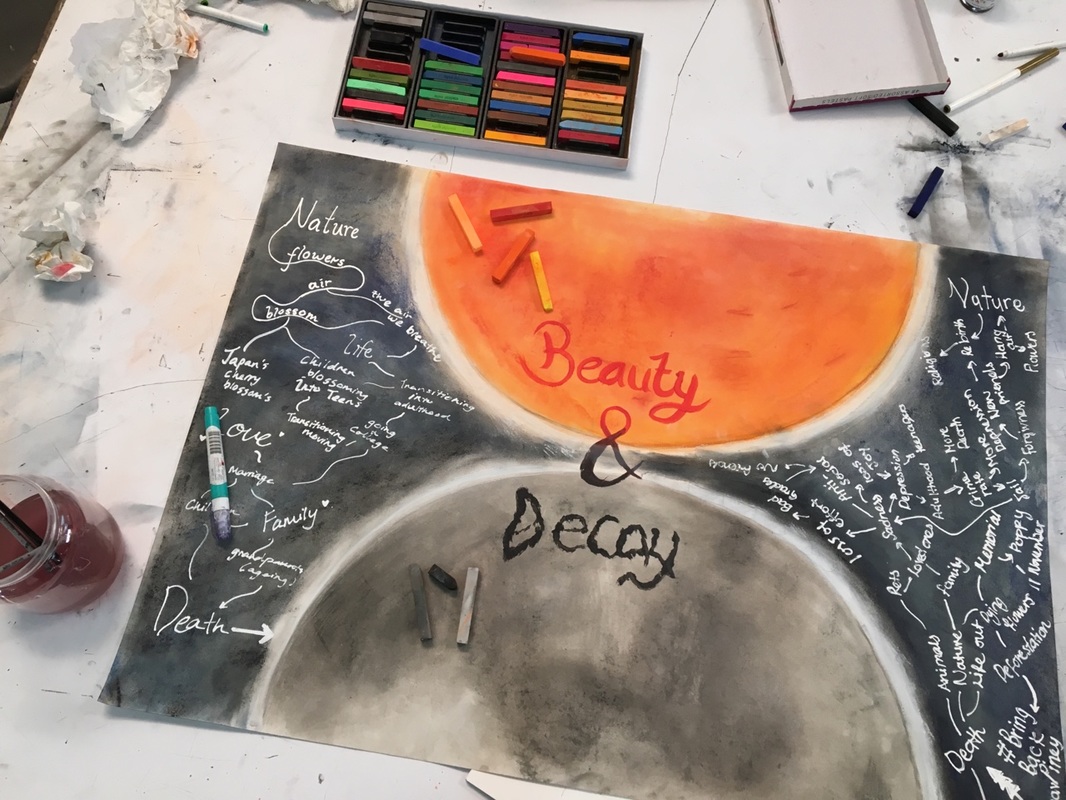
Today, we were asked to make a mind map with a partner about the topic “Beauty and Decay”. The wheels in my brains started turning and I had an “A-ha!” moment. I thought about the Sun and the Moon. Our world revolves around the Sun and the Moon, so I though ‘Why Not?”. We represented Beauty with the Sun because the Sun emits off sunshine and light and is related to all things bright and beautiful, whereas we symbolised Decay as the Moon which emits of this eery aura of darkness that makes us scared to go outside at night.
However, as we were writing out I realised that these two topics, which are completely unrelated, flows into one another. The Beauty we see in Life, Nature,etc all leads to Death and Decay. It’s a cycle I guess.
We find Beauty in Decay, and Decay in Beauty
However, as we were writing out I realised that these two topics, which are completely unrelated, flows into one another. The Beauty we see in Life, Nature,etc all leads to Death and Decay. It’s a cycle I guess.
We find Beauty in Decay, and Decay in Beauty
Stage Two - Connections
|
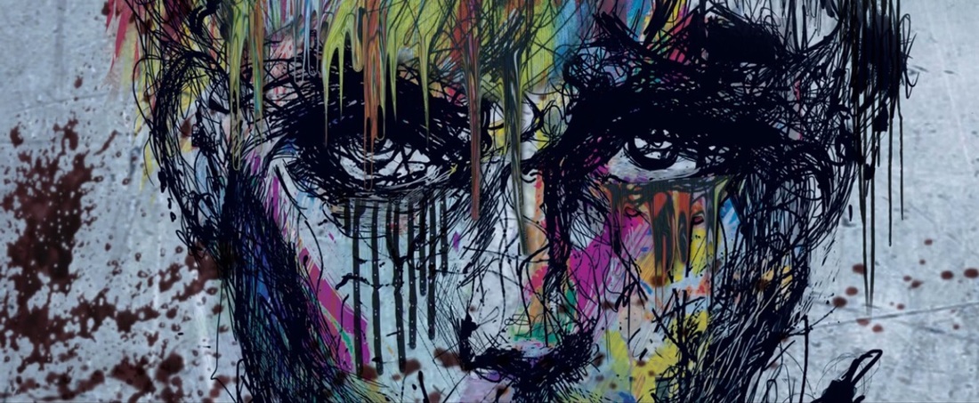
I saw this painting in a music video, and I loved how contrasting the colours are in the painting, yet quite “agree” and “compliment” each other. Also, the melting effect of the painting was what made me wanted to put that element in my painting. The colours are bright, yet the painting wanted to express sadness and solemnity. That was the kind of feeling I wanted to portray in my painting.
|
|
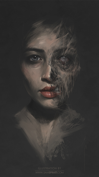
I found this picture randomly on the world wide web and it really intrigued me. I really liked how the face is sectioned into two complete opposites, yet they blend into each other very well. It also expressed a dark but humane feeling, which somewhat reflects us humans in this world. I found this illustration eery, yet captivating, which quite fits the theme I wanted to portray (”We see Beauty in Decay, yet also Decay in Beauty”). |
|
Matin Abedi, The Invisible Forest Series, 2014
|
Elnaz Javani, Destination, 2014
|
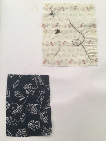
As i was going through ideas for my final piece, I was thinking of how to portray my idea of decay. So, I was thinking of covering the mouth of my “person” and it lead to stitching her mouth to display that “she” was trapped and is unable to speak her opinion.
Fortunately, there was an exhibition held recently in Oman called “Middle Eastern Art - Weaving Its Way West”. According to the Collectionair.com, the exhibition emerges the art scene and a “tactile emerging art trend”. It showcases the art scene of the Middle Eastern and also showcases the creative new trend of craft, specifically thread and textile.
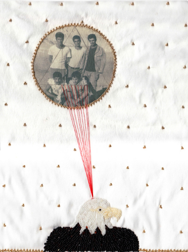
So, the artwork on the left (or thread-work) is by Matin Abedi. According to Collectionair.com, Matin Abedi was born in Isfahan and lives and works in Iran. She frequently uses beading, linen, photographs, and thread to make this new sort of contemporary portrait work. Many of her artworks have been displayed in exhibitions such as “Good News” from Iran, “Pasinger Fabrik”, in Munich, Germany, and many more.
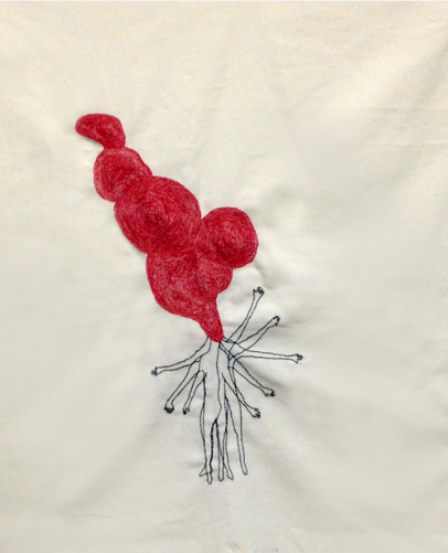
The artwork on the right is by Elnaz Javani who is also an Iranian artist. She uses materials such as thread, fabric and everyday materials and imbeds them into artworks, sculpture and more. Many of her works showcases the themes of vulnerability, loss, identity and more. She had numerous exhibitions such as “Dealing with People” and has done artist residences in Spain, France and Switzerland.
Fortunately, there was an exhibition held recently in Oman called “Middle Eastern Art - Weaving Its Way West”. According to the Collectionair.com, the exhibition emerges the art scene and a “tactile emerging art trend”. It showcases the art scene of the Middle Eastern and also showcases the creative new trend of craft, specifically thread and textile.
So, the artwork on the left (or thread-work) is by Matin Abedi. According to Collectionair.com, Matin Abedi was born in Isfahan and lives and works in Iran. She frequently uses beading, linen, photographs, and thread to make this new sort of contemporary portrait work. Many of her artworks have been displayed in exhibitions such as “Good News” from Iran, “Pasinger Fabrik”, in Munich, Germany, and many more.
The artwork on the right is by Elnaz Javani who is also an Iranian artist. She uses materials such as thread, fabric and everyday materials and imbeds them into artworks, sculpture and more. Many of her works showcases the themes of vulnerability, loss, identity and more. She had numerous exhibitions such as “Dealing with People” and has done artist residences in Spain, France and Switzerland.
Stage Three - Observations
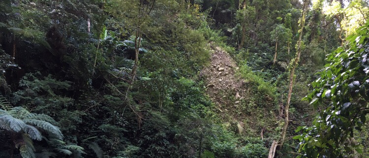
This was taken during the time I went to a summer volunteering camp in Indonesia. On the second day, we went hiking in this really huge forest. During the hike, I was mesmerised by the life in the forest. There were a variety of plants and wildlife, so when doing the topic of “Beauty and Decay” , I thought about the plants that I noticed during the hike. It’s not clearly seen in the pictures, but there were a lot of vines that were hanging and clutching to the trees in the forest. I found that the vines really connected with the aspect of “beauty” as it was really beautiful seeing them clutching on trees, as if it were a decoration, yet it also connected with the aspect of “decay” as the vines seemed “lifeless” and also that it was “clutching” for support/life on the trees. I wanted to incorporate these element of the vines into my painting.
Stage Four - Development
This was a rough sketch of what I initially wanted my final outcome to be. I felt that the vines really worked out well and it could be interpreted really well. I did not really worked on the other side yet as I did not really thought of what I wanted to do for the “happier” side. Through the weeks, I used this as my reference in what I wanted my art piece wanted to look like.
|
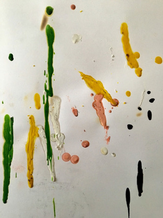
As part of my project, I decided to experiment by melting wax crayon to create the “dripping effect” to portray the “melting” part of my project. At first I was quite confused on how to do this effect and I had no experience in doing this before. The end result was slightly weird. I think I would have to look at a tutorial on how to do this and also, I felt the the crayons were a bit too “thick”. It was hard to melt them with a hairdryer, so I had to use matchsticks, but the problem with that is that the matchsticks burns out quickly, so the dripping effect does not showcase very well. Also, the crayons solidifying back really quickly, so I would have to work faster (as you can see by the dots and the short lines). I might have to buy crayons that are less dense/thick and also maybe I should use a lighter next time or a better hairdryer. |
|
I practiced with thread beforehand so that I wouldn’t mess up my final art piece. I used the method of “back stitch”. It is a very simple stitch and it is one of the basic stitches in embroidery. I chose this stitch as I found this stitch very neat and tidy. Back Stitch procedure (from : www.holiday-crafts-and-creations.com/backstitch.html) :
|
|
|
|
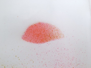
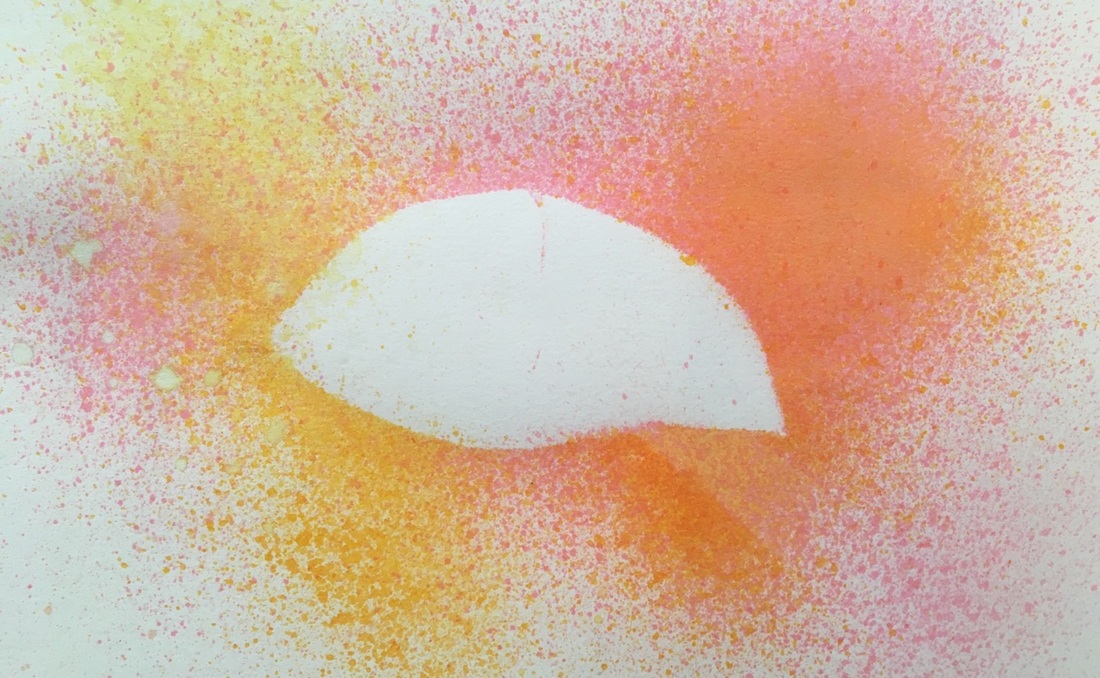
I experimented the technique of spraying ink using a defuser to create an effect which makes it seem that the colour “bursted with life” using the shape of the eye. I wanted to put this element into my art piece in relation to the theme of “beauty” as some see beauty as if it’s lively and filled with brightness, hence why I chose the bright colours. I think this effect would showcase the theme evidently.
Final Piece + Artist Staement
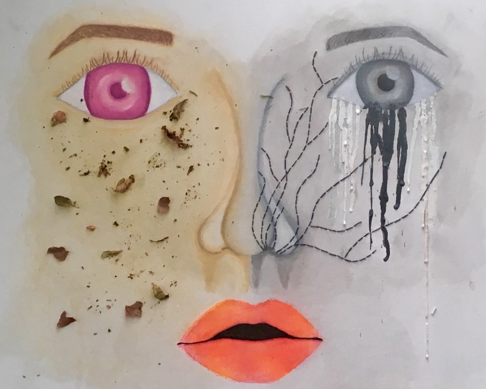
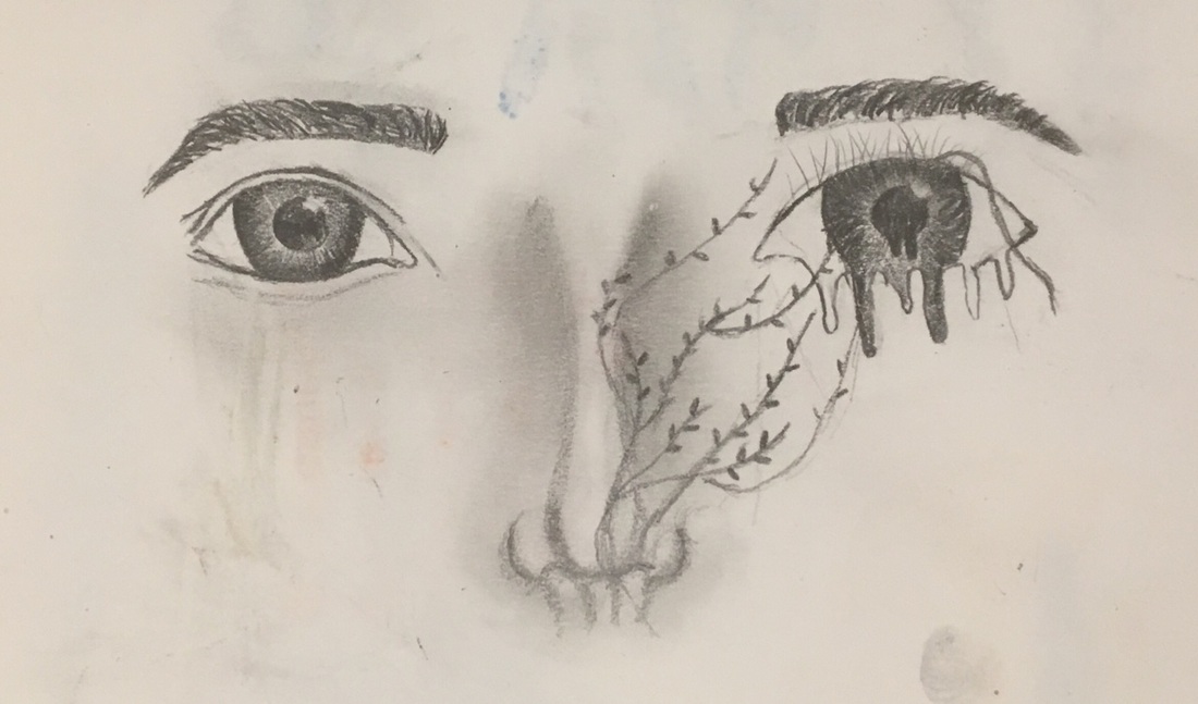
After 3 and ½ weeks, this was my final outcome. I believe that I expressed my interpretation of the theme “Beauty & Decay” well through this painting.
My painting is a face but it is sectioned into two ; one a depressing side, and the other a more “normal” looking side. The mouth was to represent a common ground between the two opposites.
On the left side, I expressed the theme of “Decay”. I’ve always found the process of aging dull and a sorrowful process. We will be more burdened, more responsibility are held, and having “fun” seems such a privilege. That was what I wanted to express in my painting. The eyes “melting away” was to show how as we “decay”, our body starts to “melt”, meaning it starts to weaken, be more frail. The “vines” were to show that death was “nearing” and “capturing” us as we decay. The choice of colour was to express the solemn and monotonic feelings as we grow older.
On the right side, I expressed the theme of “Beauty”. Even though the process of aging is really glum, we still have our childlike behaviours still remain. The purple colour of the eye was supposed to represent the quirky characters a child has and it adds a mysterious and ambiguous feel to the painting, which are also characteristics of children. The leaves were supposed to represent about how even though we’re aging, our original state still remains.
As for the mouth, I made the lips bright orange, to represent that we have so much ideas to talk about and the colour orange usually attracts attention, which is what children want : attention. However, I painted the inside black to express the hollow feeling and how sometimes, we have to filter out our beliefs and ideas as some of them do not get accepted. This is what we realise as we grow older.
Overall, I felt that my piece turned out better than what I’ve expected, however if I were to improve it, I would choose livelier leaves instead and try to brighten up the happier side
